Restaurant Reservation App
dineOn
Canadian Reservation & Waitlists Platform
Mission & Core Values
Smart Dining. Less Waiting. Local Connection. A thoughtful reservation solution designed to ease Vancouver's dining queues — helping restaurants manage crowds and customers save time, creating a better experience on both sides of the table.
Project Overview
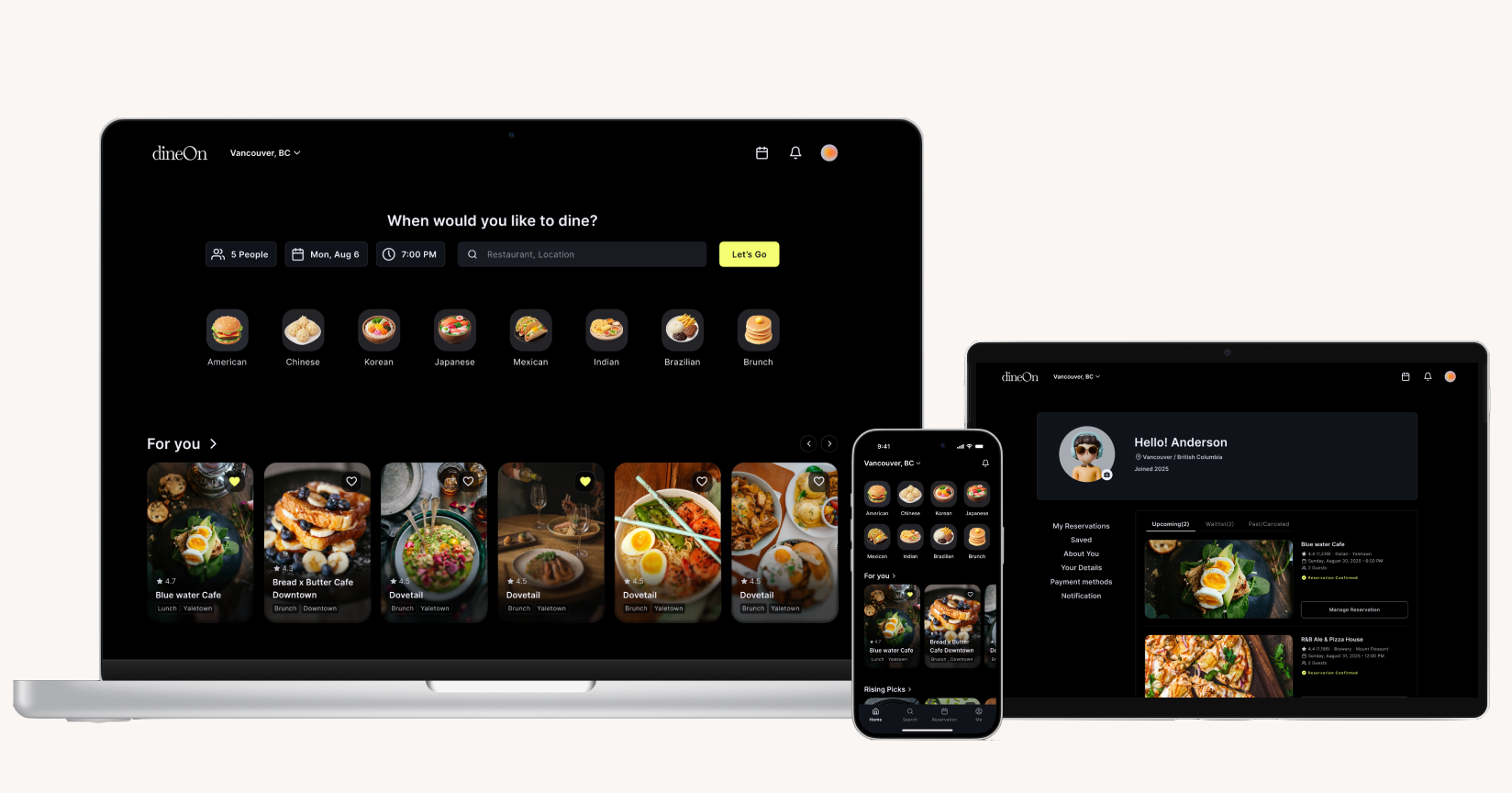
dineOn is a comprehensive restaurant reservation and digital waitlist platform designed to solve the frustration of physical waiting at popular dining venues.
The platform enables users to join waitlists remotely, receive real-time updates, and discover alternative dining options with shorter wait times.
Client & Industry
dineOn, Vancouver
—
Restaurant Reservation Platform
My Role
Brand Identity Lead
UI/UX Designer
Research
UI Kit
Prototype
Type
Reservation &
Waitlist App
Platform
App / Desktop / Tablet
Team & Timeline
Team of 3
with May Im & Kanari Mori
—
12 Weeks — August – October 2025
The Challenge
1. For Customers Addressed FirstInconsistent wait times, lack of alternatives, and the anxiety of not knowing how long they'll be standing outside.
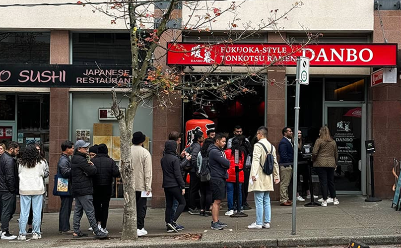
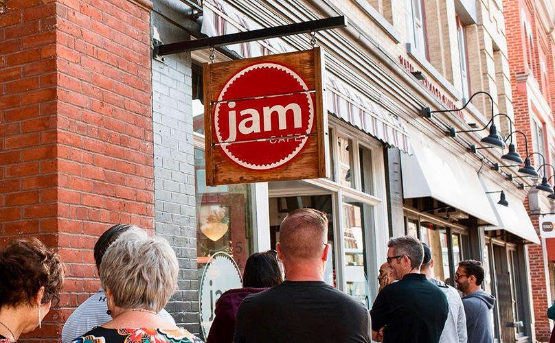
2. For Restaurants & the CommunityLong lines block sidewalks, customers drop off before being seated, and owners struggle to manage capacity.
The Solution
A platform combining reservation booking, remote waitlist functionality, and intelligent restaurant recommendations to transform the dining experience from frustrating to seamless — built around two core goals:
1. Less WaitingOnline waitlist functionality that lets diners join remotely instead of standing in line.
2. More OptionsExpanding to more casual restaurants and cafés to give users broader choice.
Competitive Landscape
OpenTable — Strengths & Weaknesses
StrengthsHigh brand recognition and a wide restaurant network.
WeaknessesRestaurant-centric with limited focus on walk-ins and casual diners or cafés, and no wait-time suggestions.
➜ The opening dineOn was built to fill.
dineOn — Strengths & Weaknesses
StrengthsSolves the pain of in-person waiting with more local restaurants and cafés, plus real-time wait tracking.
➜ Directly addressing OpenTable's gap.
WeaknessesLower brand recognition and trust in the early stages — user and restaurant onboarding may take time.
HMW Statement
" How might we eliminate the friction of physical waiting at restaurants while helping diners discover more dining options that match their preferences and availability? "
Our Approach
STEP 1. Discover — Understand the Problem
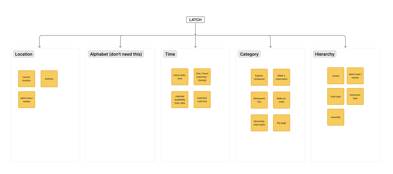
- LATCH analysis and card sorting
- Conducted tree testing and reorganized content
- Designed simplified user flows
- Designed a simplified sitemap
UX Honeycomb Analysis
We audited the existing waitlist landscape against Peter Morville's UX Honeycomb to pinpoint exactly where the experience was falling short before designing anything new.
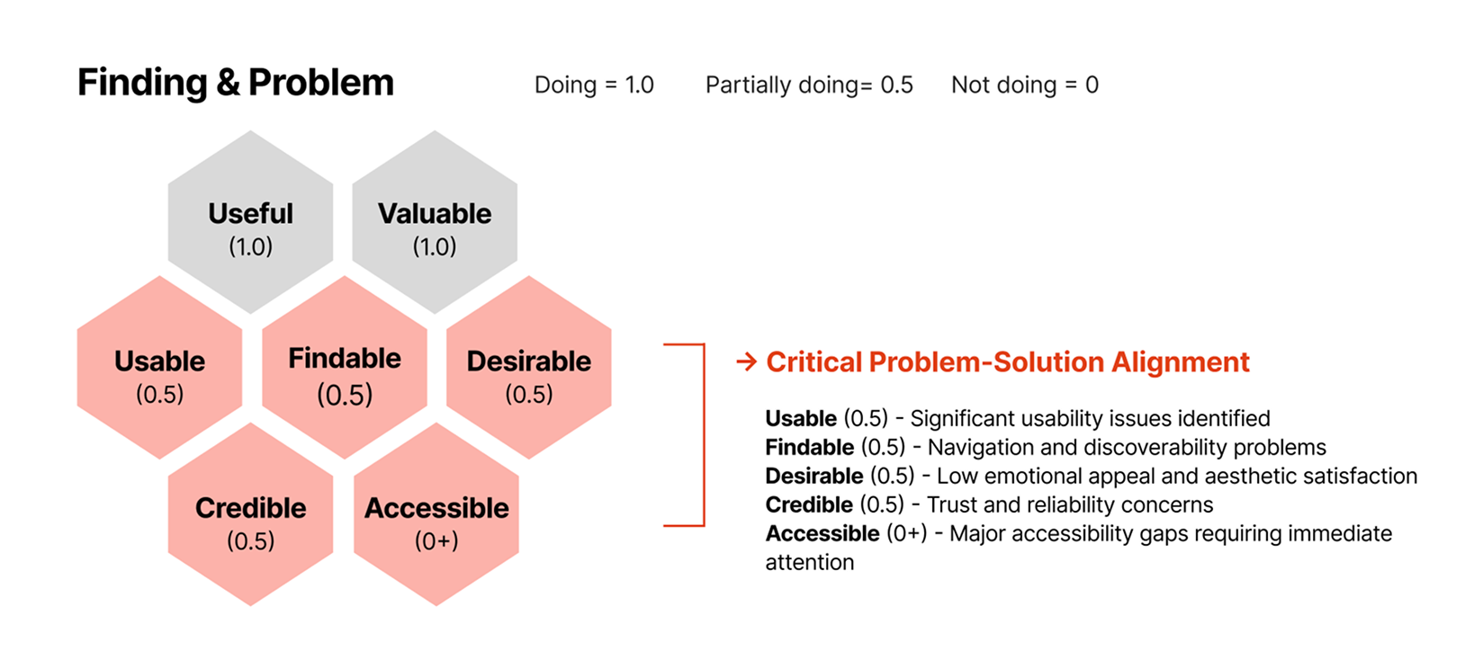
Usable (0.5) — significant usability issues · Findable (0.5) — navigation and discoverability problems · Desirable (0.5) — low emotional appeal · Credible (0.5) — trust and reliability concerns · Accessible (0+) — major accessibility gaps requiring immediate attention.
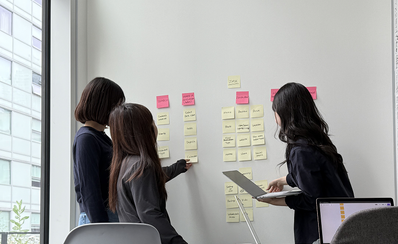
LATCH Analysis & Card Sorting
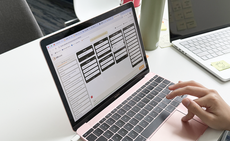
A closed card sort with 5 participants: we created 6 parent categories from the app's core features, made 50 child cards for individual functions, and used UXtweak to validate whether our structure matched user expectations.
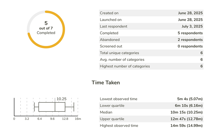
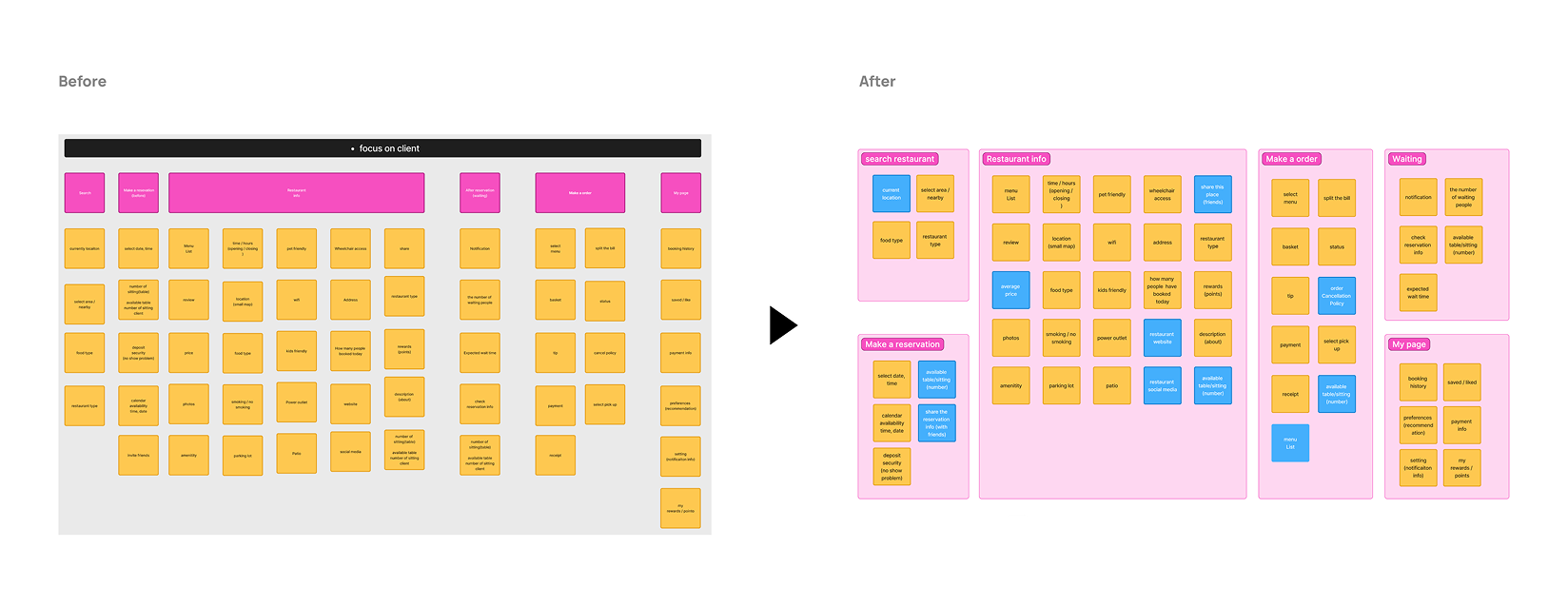
5 of 7 respondents completed the sort, landing on 6 categories on average — a strong signal that our proposed structure was intuitive and ready to move into the sitemap.
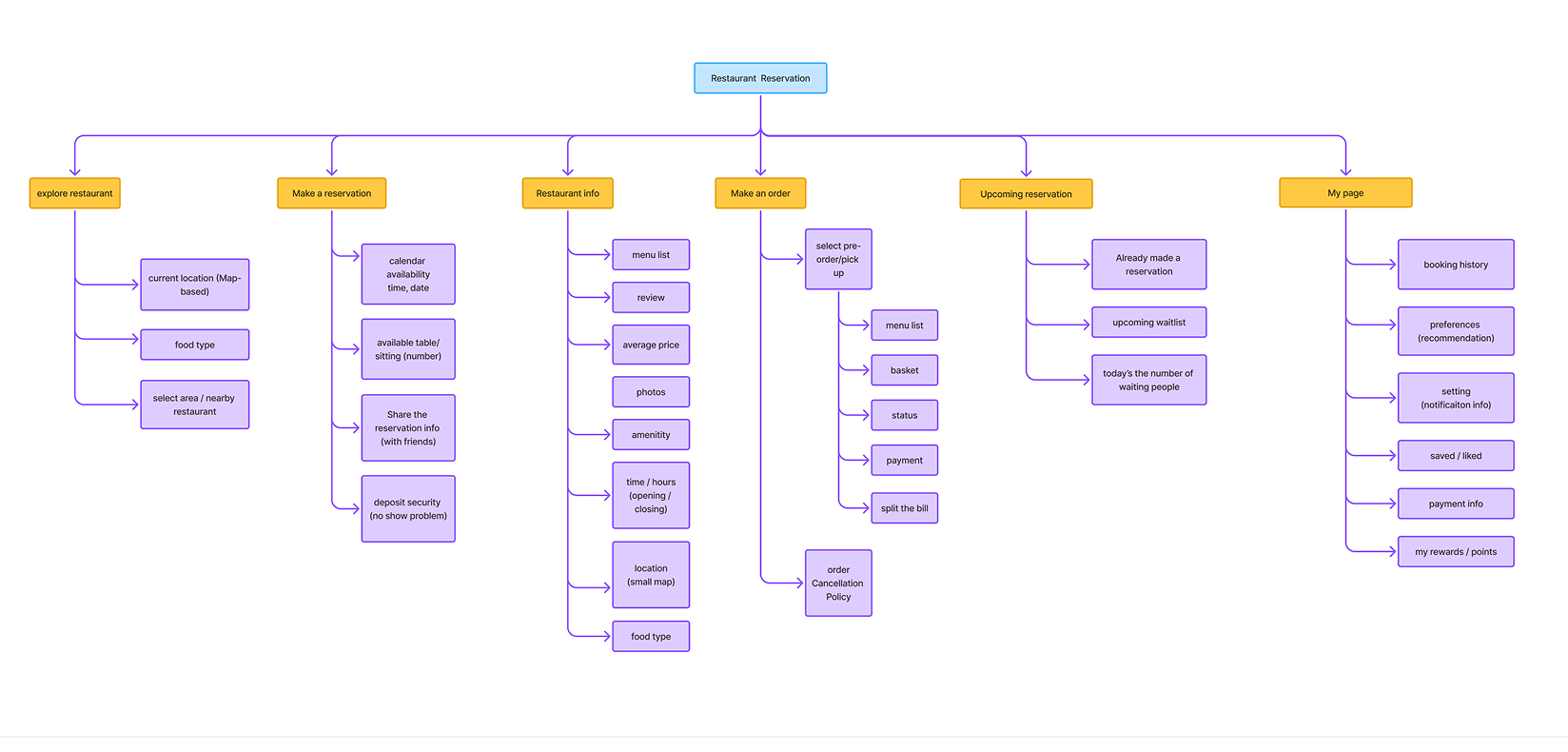
Site Map — restructured around search, reservation, restaurant info, ordering, and waitlist
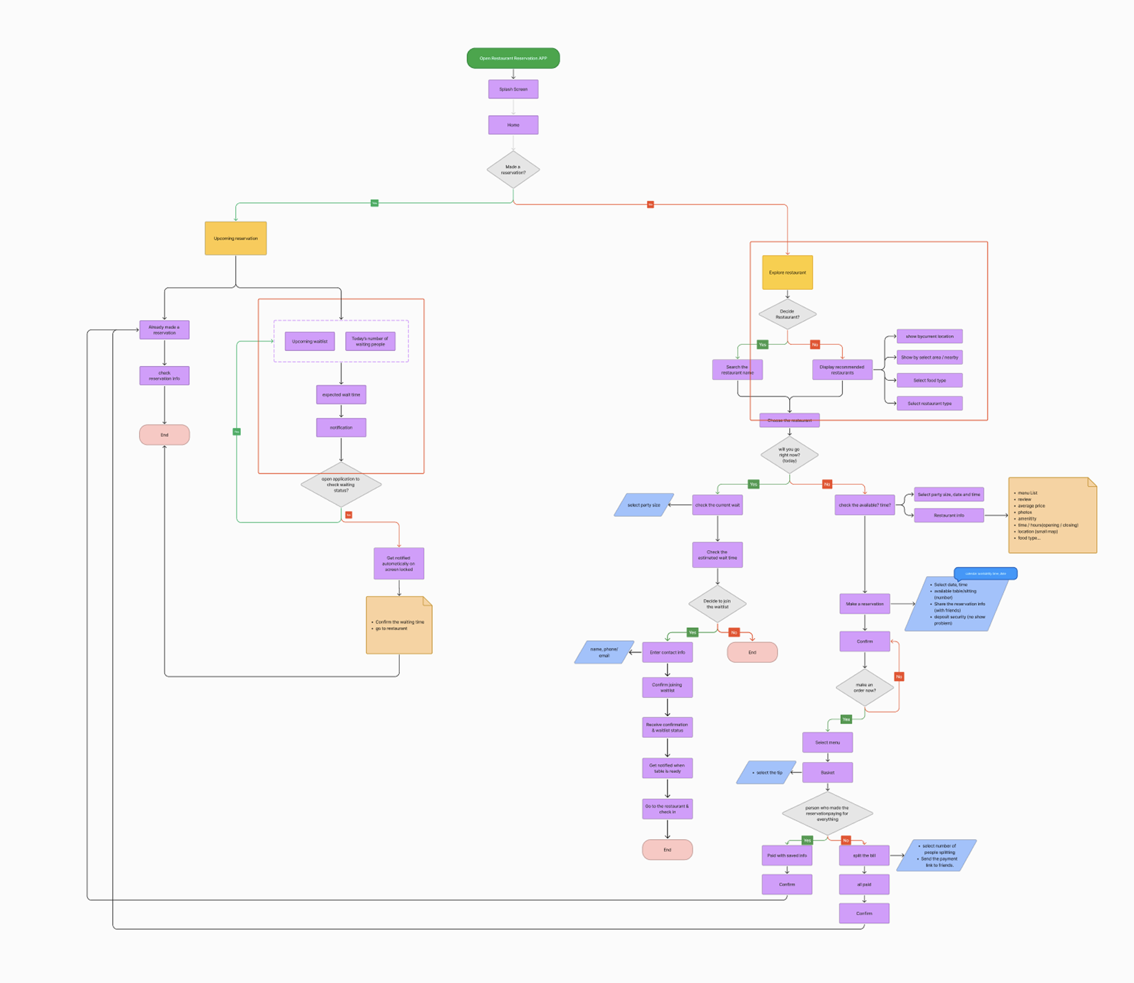
User Flow — making a reservation & checking waiting time
Tree Testing
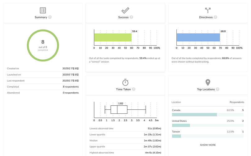
Two rounds of tree testing with 8 respondents: the first round scored a 59.4% success rate and 68.8% directness rate — below target — so we rewrote the task questions and re-tested to validate the fix.
Note 1 — Patio Info
Before: 12.5% success, 1 direct → After: 100% success, 7 direct
Rewriting the task question to name the specific need ("looking for restaurant information, especially wondering if they have a patio") made the right path obvious.
Note 2 — Split the Bill
Before: 37.5% success, 3 direct → After: 62.5% success, 3 direct
Clarifying "when you make an order" helped, but some users still expect "split the bill" to live inside Payment — a flag for future screen design.
Note 3 — Menu List
Before: 37.5% success, 2 direct → After: 37.5% success, 1 direct
No improvement — a reminder that understanding real user behavior matters more than the research tool used, and this path needs deeper rework.
STEP 2. Design — Build Solutions
- Created wireframes prioritizing transparency
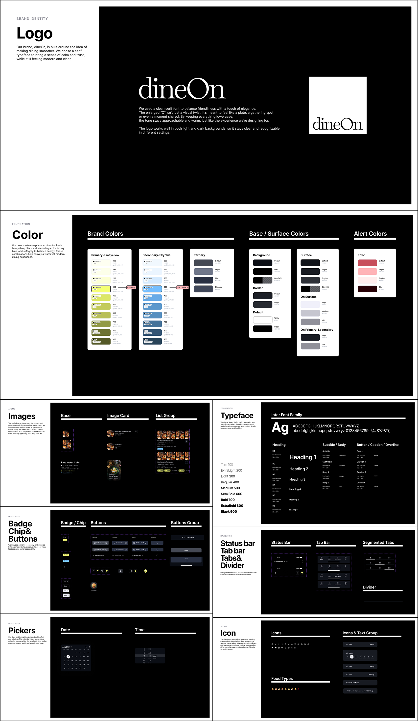
- Built an accessible UI kit following WCAG AA standards
- Established a brand identity reflecting speed and trust
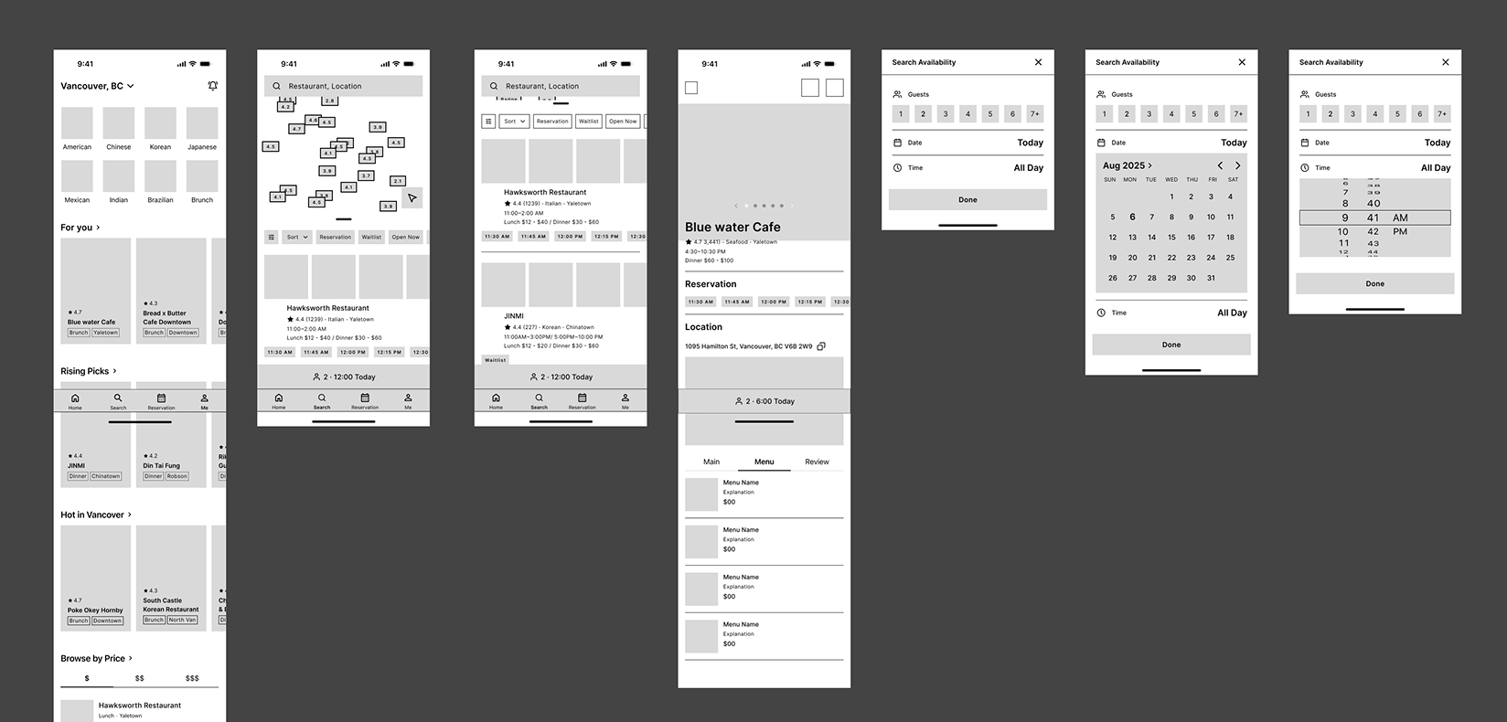
Wireframes
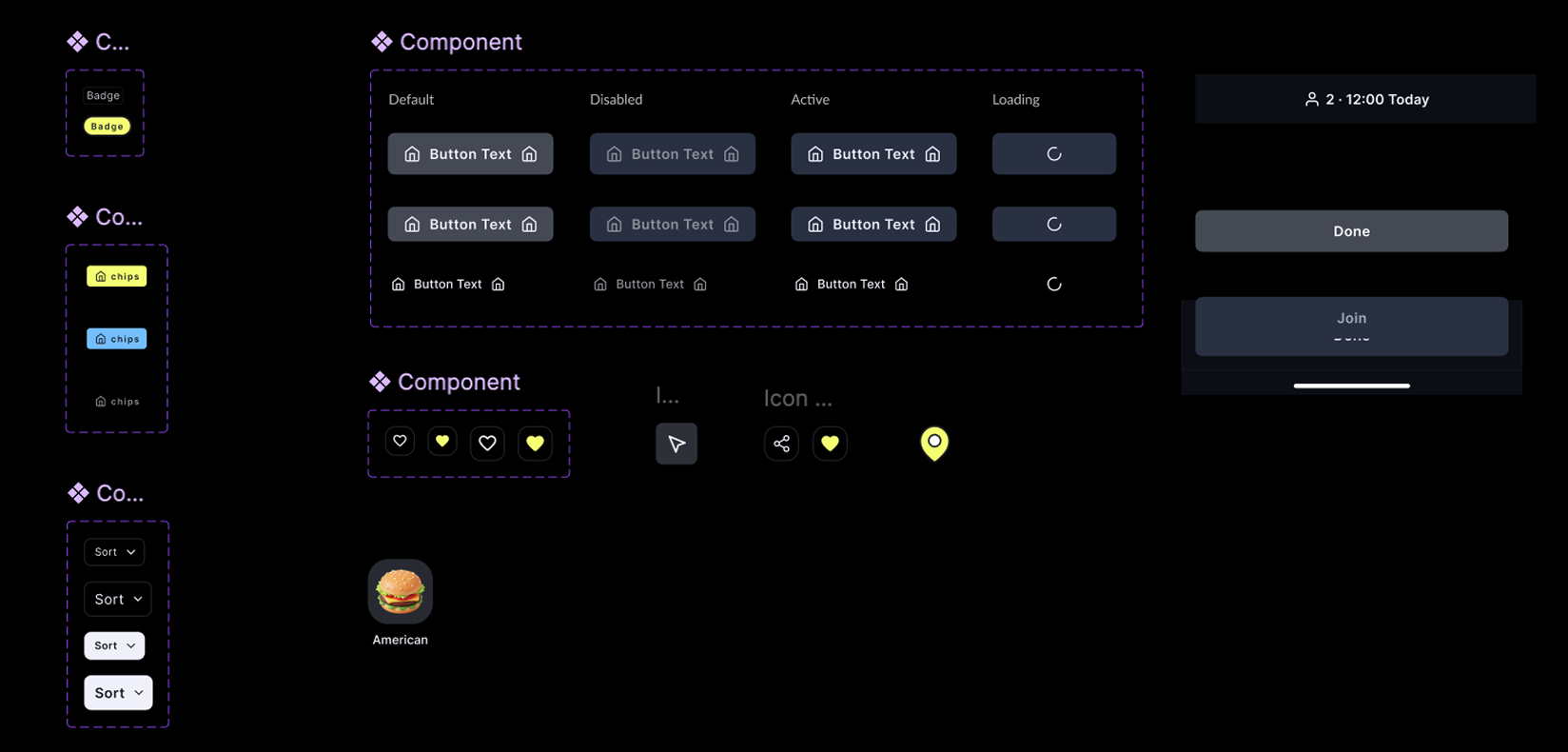
UI Kit
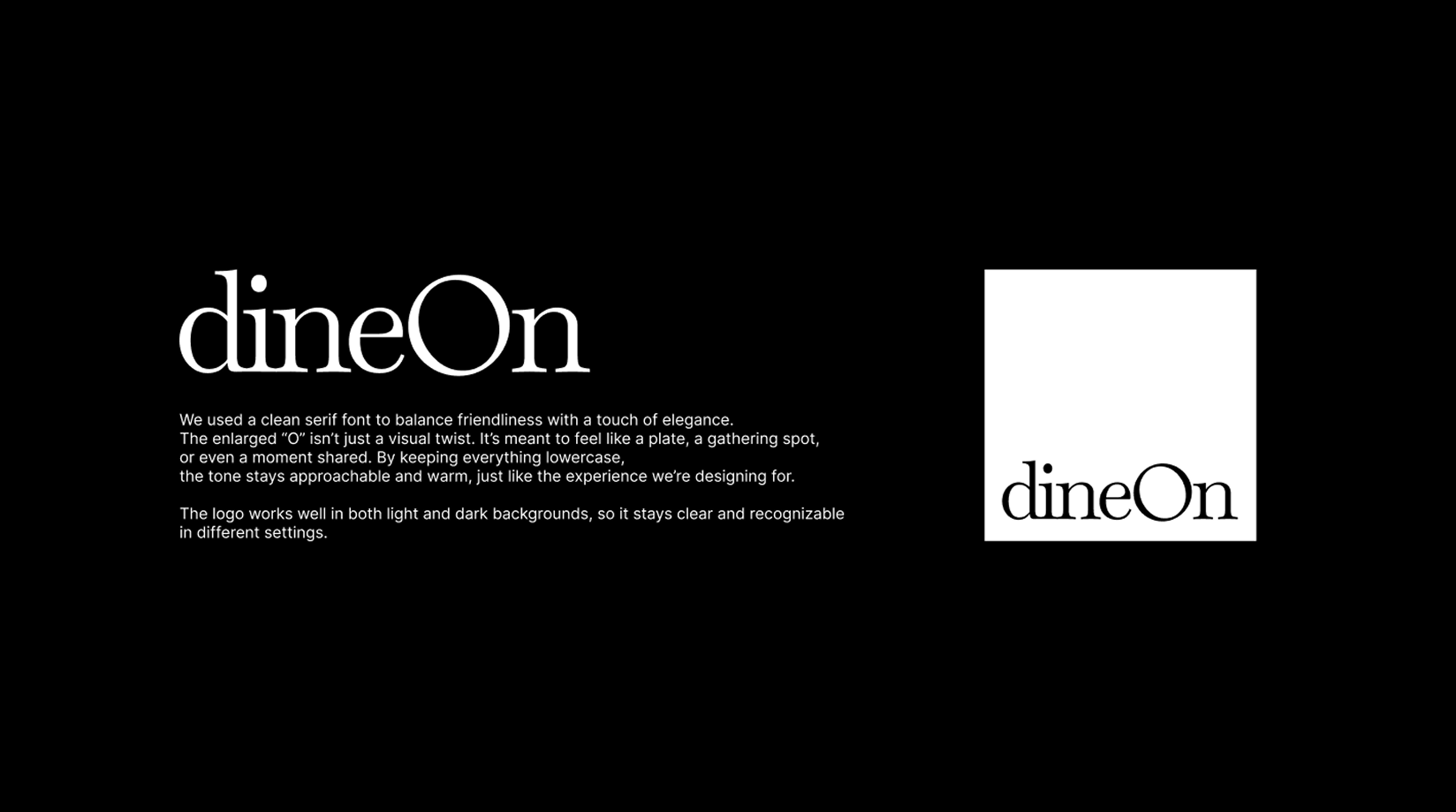
Brand Identity
STEP 3. Define — Validate with Data
Validated the STEP 1 diagnosis with real users — through surveys, interviews, personas, and journey mapping.
Quantitative — Survey for User Research
23 respondents, a 4-part survey covering current reservation habits, feature preferences, usability & engagement, and future adoption. 12 were Canadian residents and 7 were international students living in Canada.
60%
often wait for a table
87%
of those waits are under 30 minutes
78%
rated the waitlist & wait-time display 4–5 in importance
22/23
"very likely" to try a digital waitlist
82%
rated wait-time reduction & easy booking as highly important
70%+
likely to use time-saving features
Qualitative — Interviews
5 interviews exploring why waiting feels frustrating and what information users need most.
- Users combine multiple sources (Google Maps, social media, reviews) before booking
- 4 of 5 still had to wait even after booking
- Main frustrations: uncertainty, wasted time, poor environment (noise, hunger)
- 5 of 5 would use a remote waitlist — for less stress and more flexibility
- Estimated wait time and notifications are the most essential features
- Most users tolerate a 20–30 minute wait before dropping off
Persona

Chloe Smith
About
- Works full time in marketing
- Enjoys dining out with friends on weekends
- Uses apps to explore restaurants and manage time
Goals
- Enjoy dining out without stress
- Save time and avoid uncertainty
- Access popular restaurants more easily
Pain Points
- Often waits 15–30 minutes even with reservations
- Frustrated by uncertainty and wasted time
- Uncomfortable waiting environments (noise, hunger)
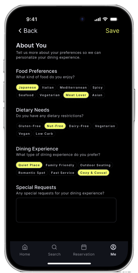
- Limited menu or dietary info
Needs
- Remote waitlist feature
- Accurate estimated wait times
- Notifications when table is ready
- Dietary filters & easier cancellation
Scenario & Journey Map
Before: books a table online, still waits 15–30 minutes on arrival, feels frustrated and uncertain in a noisy, uncomfortable environment. After, with dineOn: joins the remote waitlist, sees an accurate wait time and queue position, gets notified when the table is ready, and arrives just in time — stress-free.
| Steps | 1. Search & Book | 2. Arrival | 3. Waiting | 4. Dining (Improved) |
|---|---|---|---|---|
| Emotions & Thoughts | 🙂 Hopeful — hope I don't have to wait long | 😐 Neutral — will I get my table right away? | 😣 Frustrated — how long will this take? | 😌 Relaxed — I can trust this app |
| Actions | Reserves a table online | Arrives at the restaurant | Waits 15–30 minutes | Joins remote waitlist, gets notified, then dines |
| Pain Points | No info about real waiting time | Sometimes still had to wait | Uncertainty, wasted time, noise | None — the wait happens remotely |
| Opportunities | Show estimated wait time when booking | Remote waitlist before arrival | Accurate wait time & notifications | Clear info, dietary filters, easy cancellation |
STEP 4. Test & Refine — Iterate Based on Feedback
5 participants worked through a structured session — introduction, warm-up questions, three core tasks, wrap-up questions, and closing.
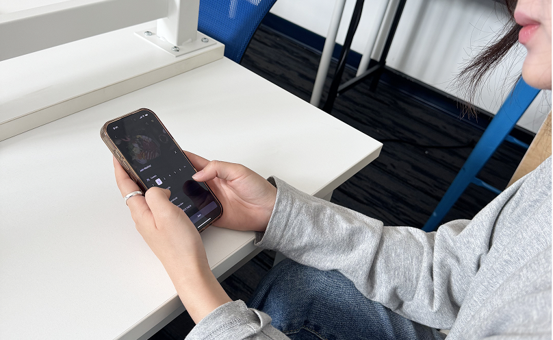
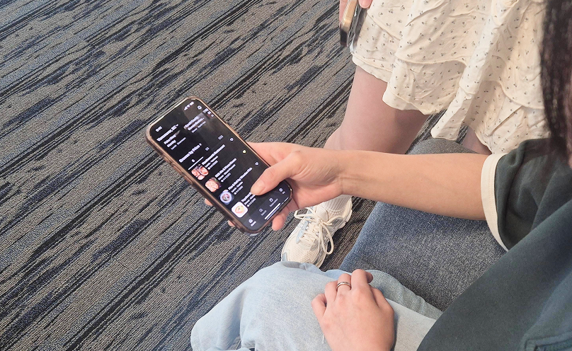
Task 1 — Curated Lists & Favorites
Success Rate40% (2/5)
Time on Task52s (exp. 24s)
Error Rate65%
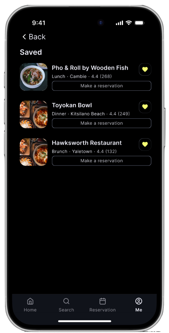
✓ Saved button was intuitive
✗ Looked in Search, not home; didn't expect Michelin as its own section
Task 2 — Search Availability
Success Rate80% (4/5)
Time on Task56s (exp. 46s)
Error Rate60%
✓ Selecting guests/date/time was smooth
✗ "Search Availability" read as plain text, not a button
Task 3 — Waitlist
Success Rate100% (5/5)
Time on Task1m 22s (exp. 1m 30s)
Error Rate5%
✓ Join process was clear and straightforward
Tasks were generally completed successfully, but UI visibility (buttons and categories) and labeling (terminology) needed improvement — leading to three concrete fixes: make Search Availability visibly clickable, move Michelin under the top cuisine categories, and replace the unclear "Waitlist TOP" label with something clearer like "Long line, don't wait."
Design Display
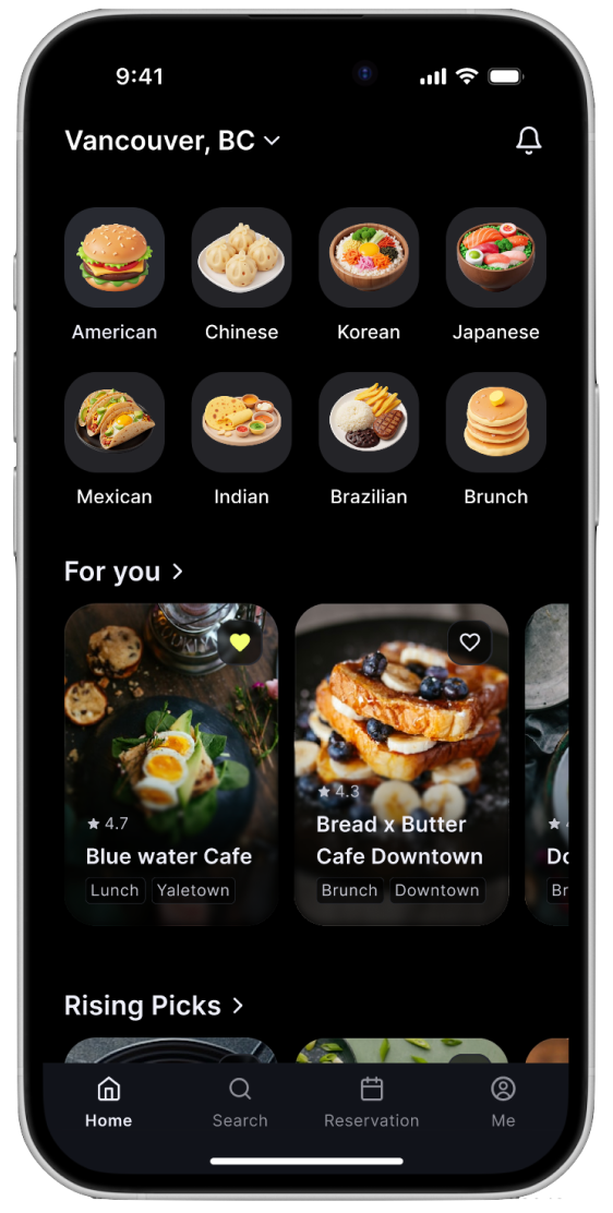
Main Features & Screens
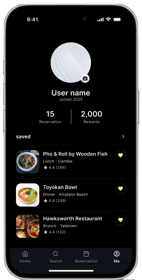
1. Home — Discover & Browse
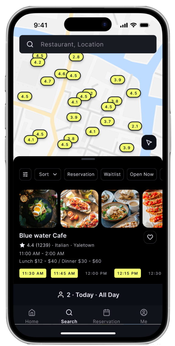
2. Search — Map & List View
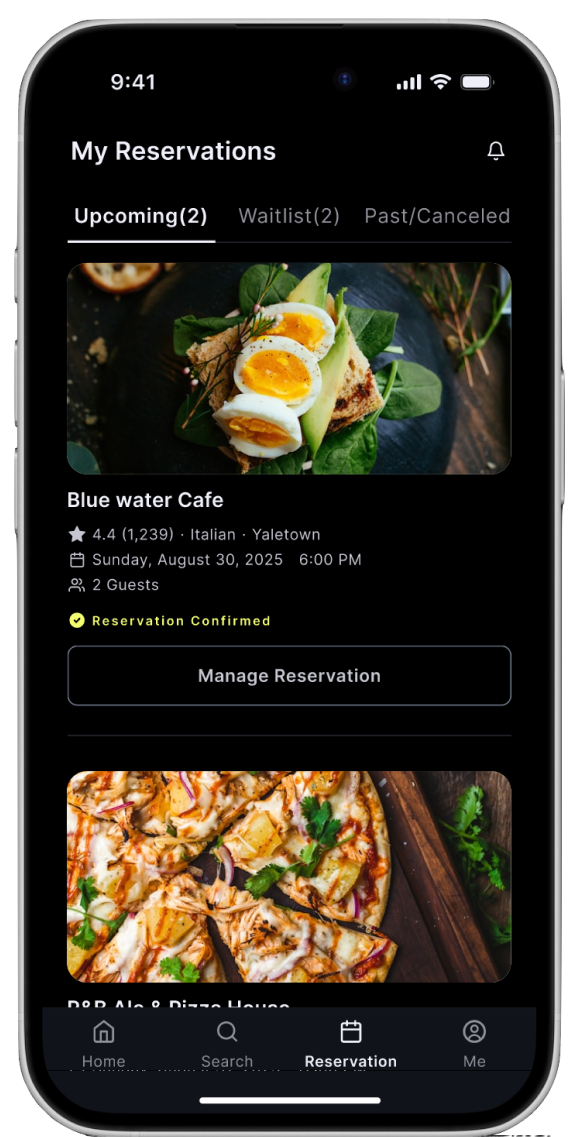
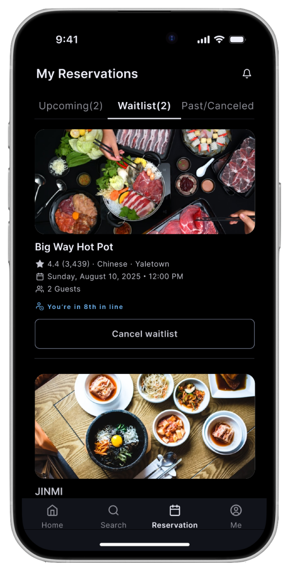
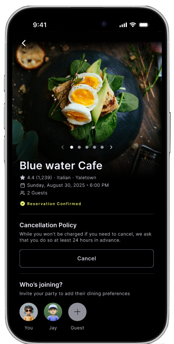
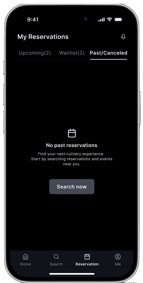
3. Reservation — Manage Active Waitlists & Bookings
4. My Page — Profile & Saved Restaurants
Consistent UI Patterns
Bottom navigation: Always-accessible primary navigation
Card-based layouts: Restaurant information displayed in scannable cards
Status indicators: Color-coded tags and badges for quick comprehension
Large touch targets: All interactive elements minimum 48dp for accessibility
Progressive disclosure: Show critical info first (wait time, rating), details on tap
Outcome & Impact
Across two rounds of research and testing, dineOn moved from a fragmented, restaurant-centric experience to a validated, user-centered waitlist and reservation flow. The result: measurable gains in task success, grounded in 23 survey responses and 10 interview and testing participants.
95%
task completion after iteration (from 60%)
18s
average time to join a waitlist (from 47s)
100%
success on the core waitlist task (5/5 testers)
78%
of survey respondents want a digital waitlist
100%
info-finding success after clarifying task wording (from 12.5%)
33
total research participants across survey, interviews & testing
Reflection
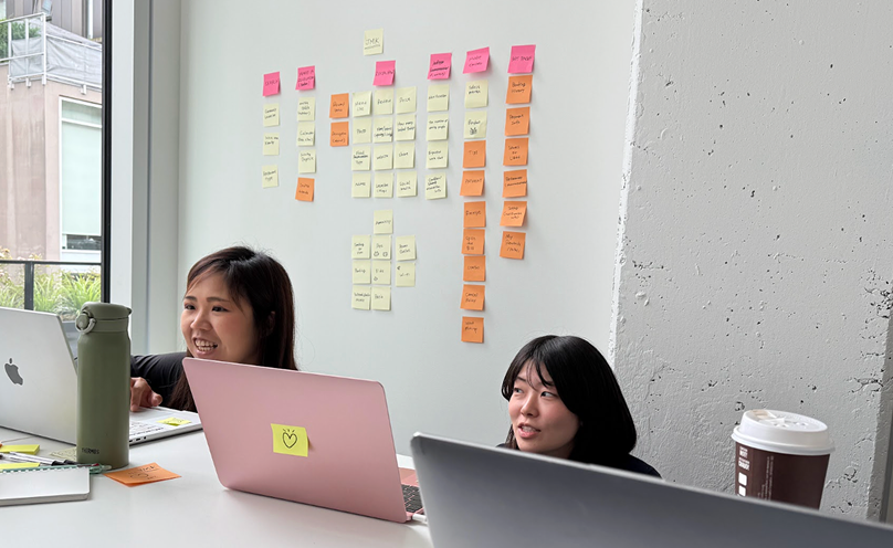
We collected insights from usability testing, surveys, and interviews, and learned that visibility and information structure are key to core features (reservation, waitlist, curated lists). Users rely not only on functionality, but also on labels and context to understand meaning.
Team Reflections
Jessie
User-centered thinking should guide the research from the very beginning. In card sorting, we need clearer, more specific cards to reduce hesitation — and in tree testing, too many options created navigation challenges we hadn't anticipated.
May
Tree testing was especially hard — our guesses were very different from the actual results. That gap is exactly what made the process meaningful, and it's why I want to keep using tools like UXtweak to truly understand what users think.
Kanari
Our guesses didn't match user behavior, and unclear cards caused hesitation. Keeping tasks simple and clear, and thinking user-first from the start, made the biggest difference to our results.

Next Steps
Incorporate additional needs identified in the surveys and interviews to improve the prototype. Plan a second round of usability testing to validate improvements. Redesign the information architecture for Search Availability and the Michelin category.
UI Design System Guide